Developing RoR applications
Details:
Category:Branding
Client:ES
Time:Oct 2014 - May 2015
As Elegant Solutions (ES) continued to evolve as a service agency, we found that our development team’s strongest suit was in Ruby on Rails (RoR) development. In order to maximize our returns on this aspect of our operations, we decided to spin out a separate identity as a RoR exclusive development shop called 42Gems. Attracting customers to our service required us to create a professional landing page that was professional and indicative of our design style. The landing page had to both inform and interest potential clients, and lead users logically to a call to action (contacting us). Within the 42Gems hierarchy, I served as the project manager and account manager, leading the design and user experience strategy for the landing page. I also managed and informed the development of the brand guide and marketing efforts.
Designing 42Gems
Gathering Information
Whenever we set out to design a landing page, our first step is to research the competitors and the industry's current paradigms. The 42Gems team, along with our contracted social media strategist and usual graphic designer, shortlisted our top 5 landing pages and reviewed them for what we liked and didn’t like. This gave us the background we needed to start synthesizing our unique design.
Laying Out The Plan
For this project, we used JIRA to communicate development requirements to our team and Google Drive to manage design assets and content. We also used insEYEte for brainstorming and task management. Aside from ourselves as the 42Gems team, the primary stakeholders were individuals and organizations seeking RoR development services. We wanted to appeal to individuals looking to build their ideas or work on their existing web projects. Our target organizations were small agencies in web development and design who were looking to expand their teams on a per-project basis, or needed a team to provide development support to their existing services and/or infrastructure.
Creation
Once we compiled our sources of inspiration, we focused on creating a brand identity that could drive the design of the website. The name 42Gems was intended to demonstrate our nuanced understanding of the RoR culture: “Array#forty_two” is native RoR method that calls the 42nd element in an array, and “gems” are plugins used to integrate various functionality into your RoR application. To kick the branding process off, I worked with our team and our regular graphic designer (the very talented Grant Lechner) to create some concepts centered on the themes of a gem and technology. Several “gem” logos and seals were created, and in the end, we decided on a flat, simple seal that reflected the simplicity of the code our team writes and our clean designs.
To accompany this seal, Grant also generated several possible word marks and color schemes. Our final choice differentiated between the “42” and “Gems” in the name 42Gems, and our color palette used reds and dark grays.
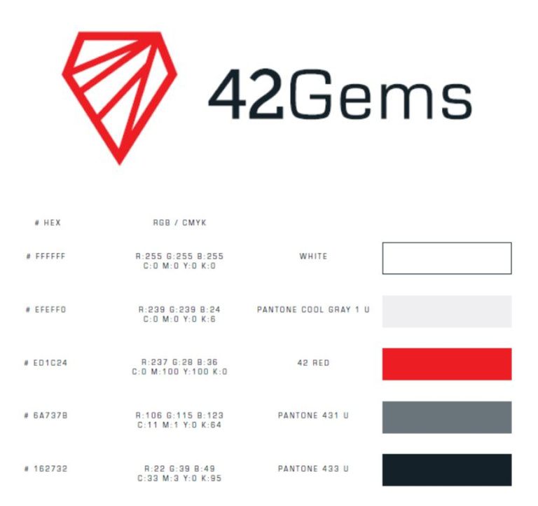
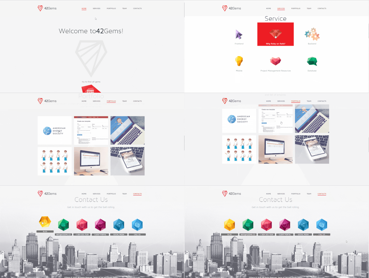
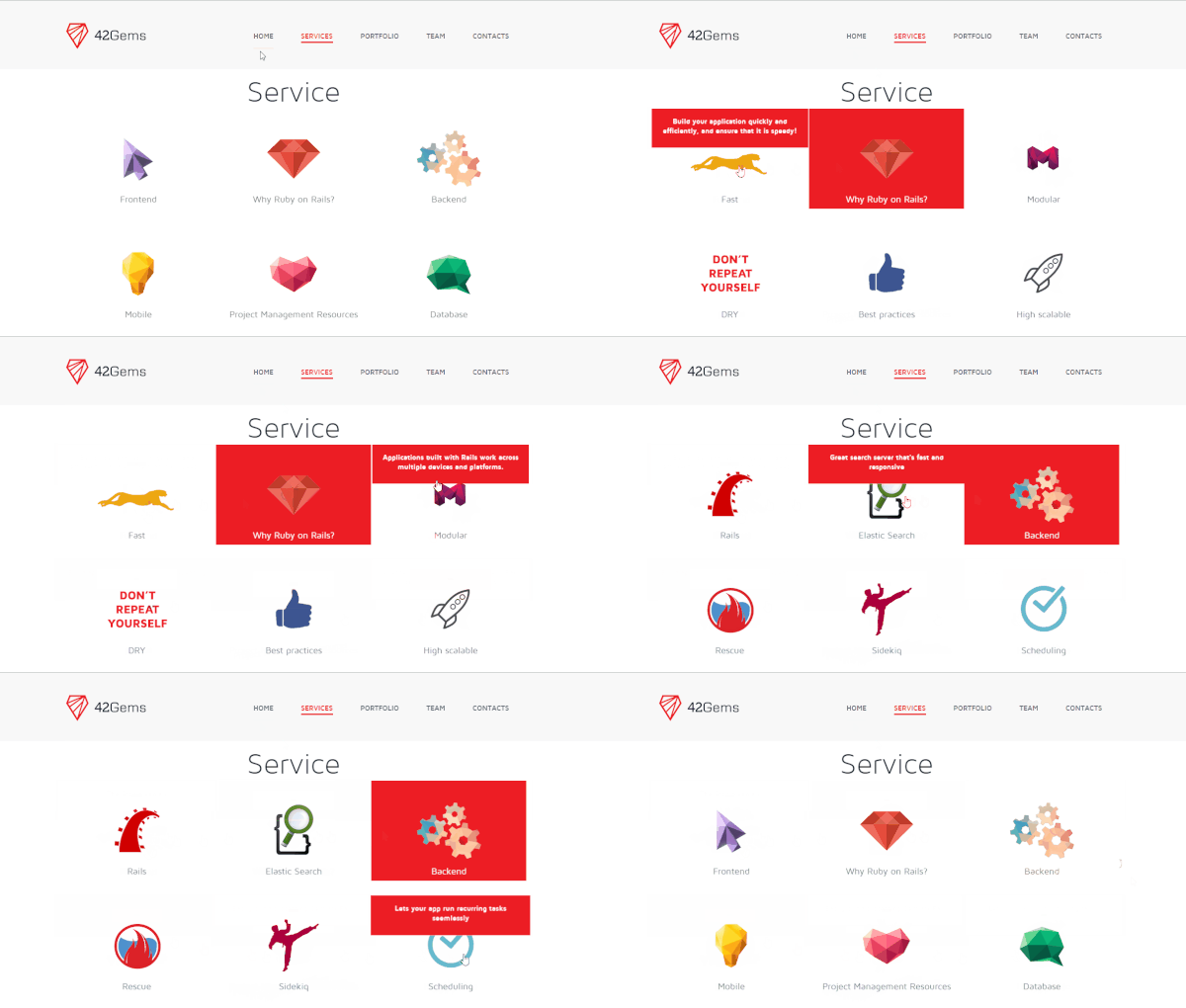
Grant compiled the seal, wordmark, color palette, and spacing guide into a complete Brand Guide, which was subsequently handed off to our designers. Drawing from elements from our inspiration sources, the design team created a unique yet compelling landing page design that built a narrative for potential customers. As I prepared the content for the services, portfolio, and biographies, I used Google Adword’s Keyword Planner to find trending words. The designers also stipulated character limits, which required me to choose my words carefully (forgive the pun!). Once all of the elements coalesced into our final layout, I worked with the developers to add animations to each section of the page. The “Services” and “Contacts” sections were especially fun to animate!
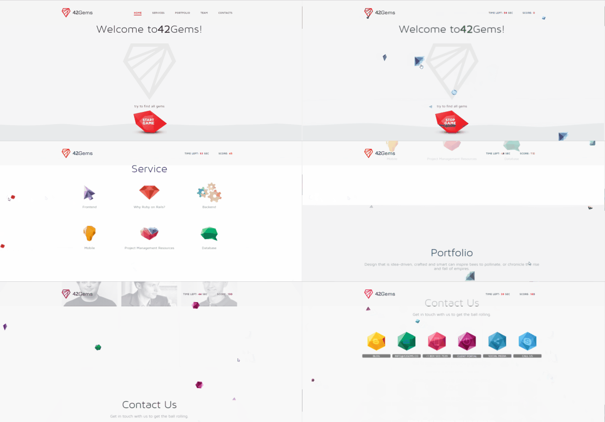
At the suggestion of the rest of the team, we included a game on the top of our landing page. This was both to add our personality to the landing page, but also to incentivize potential customers to scroll down to through the entirety of the page in a mad dash to click all of the randomly generated gems. For me, this was an opportunity to leverage gamification to enhance the user experience, and the final result was quite compelling!
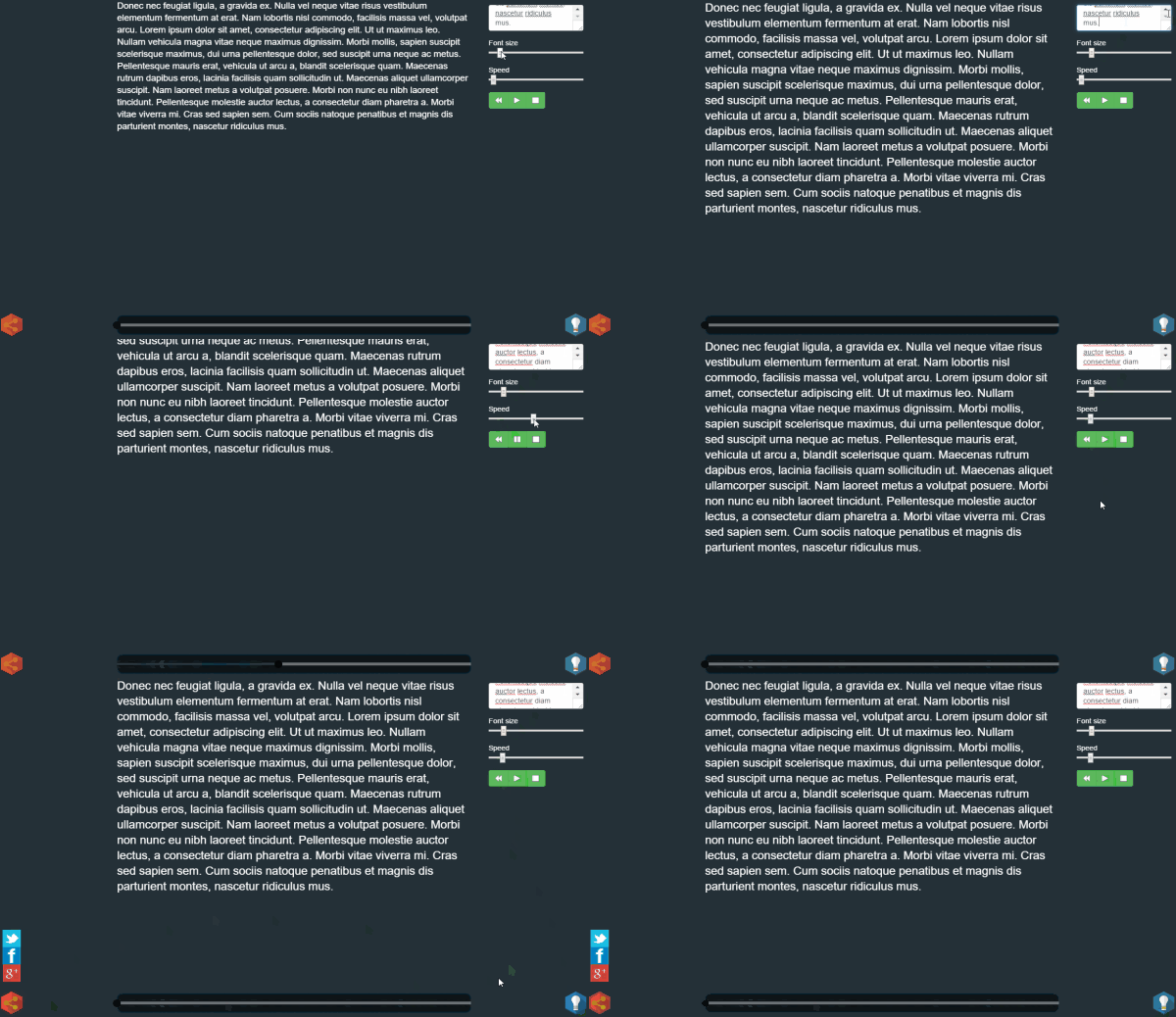
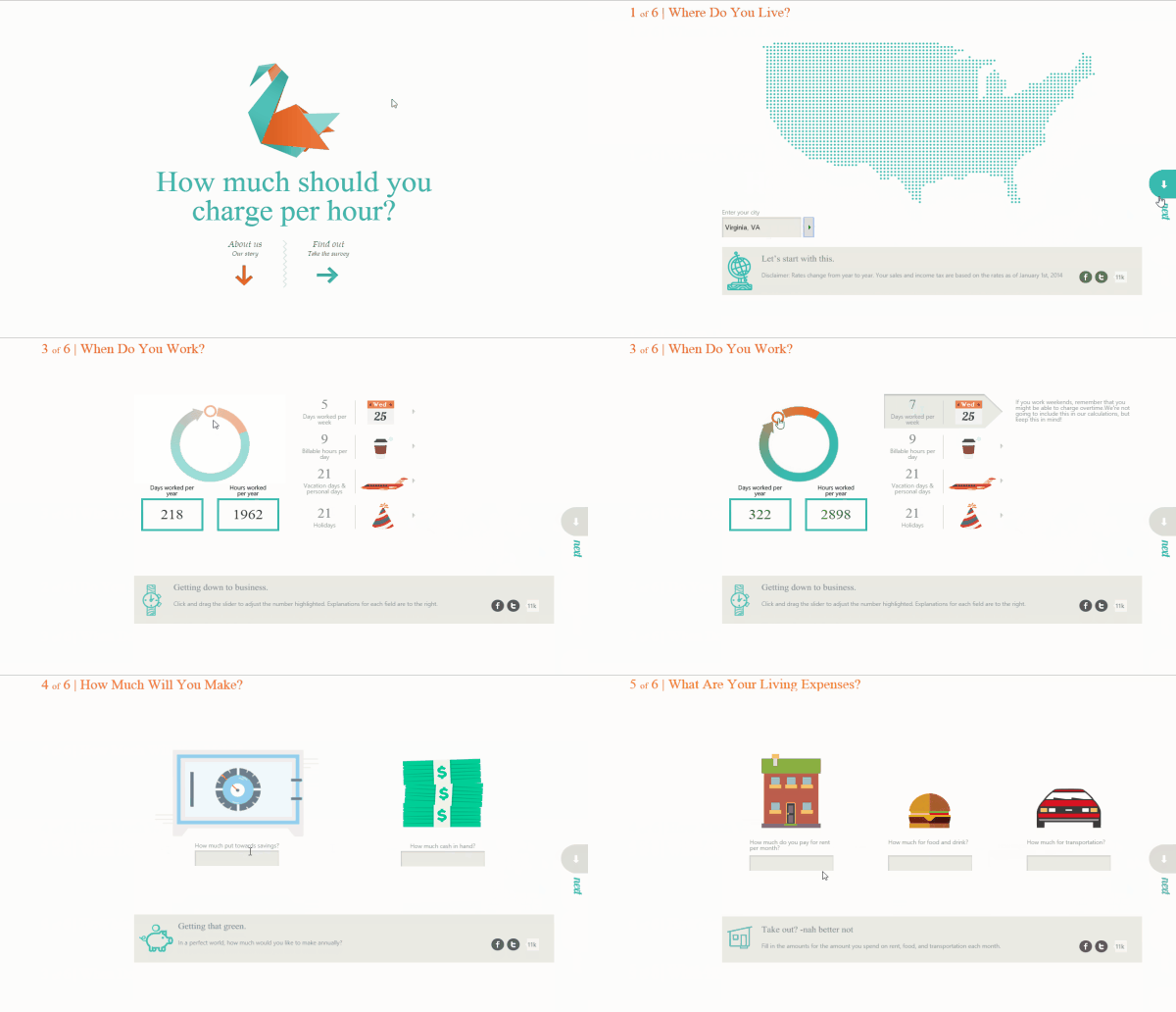
To drive traffic to the landing page, social media accounts and a blog (blog.42gems.co) were also setup in accordance with our brand guide and the social media plan designed by our social media strategist, Alex Katzen. A series of “demo-apps” were also built based on specifications and rough designs generated by our team. I managed the development of these applications, and worked with Alex to include them in our outreach and marketing plan as well. You can view some of these demo apps below:

Final Thoughts
Combining the brand guide and landing page into a cohesive user experience presented a unique challenge for me both as a project manager and product strategist, but the results were very satisfying!


