Branding an Agency
Details:
Category:Branding
Client:Archbolt
Time:Jan 2019 - Apr 2019
In 2018, the firm initially founded by Mathew Lazarus and Neil Rajpal called Mobilosophy evolved into a new identity: Archbolt. An initial placeholder brand was created, but it lacked the rigor or consistency of implementation necessary to grow brand recognition. After I joined Archbolt as Head of Product, I was tasked with leading our internal rebranding efforts. I designed, created, and implemented our brand system and standards across multiple mediums, including social media, internal documents, and print.
Designing the Archbolt Brand
Originally we explored working with an external designer to create our brand. After engaging with two designers, we found that our needs were better handled internally. This was partially due to our nuanced understanding of where the brand needed to go, and time crunches in terms of iterating on the brand itself. My first task was to home in on a visual language which appealed to all three partners (Mathew, Neil, and myself). We all had slightly different takes on what the brand should be, so this required a lot of iteration and compromise. in the end, we found clustering around our font styles (san serif), colors (blue), and the types of logos + wordmarks we wanted.

Colors
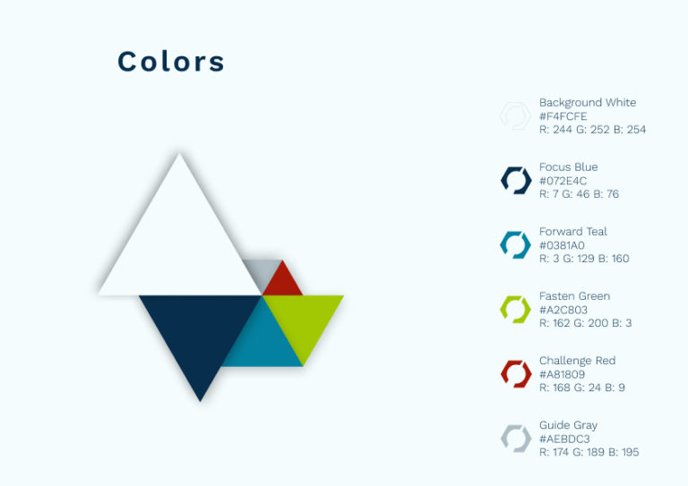
The color palette was probably the easiest portion of this project, as all three partners coalesced quickly around a primary blue color with supporting accent colors. We used a bold Teal as our accent color, and chose a muted yet unique green and red for the positive and negative colors. Rounding out our palette was a light gray for demphasis and an off-white for backgrounds.

Typography
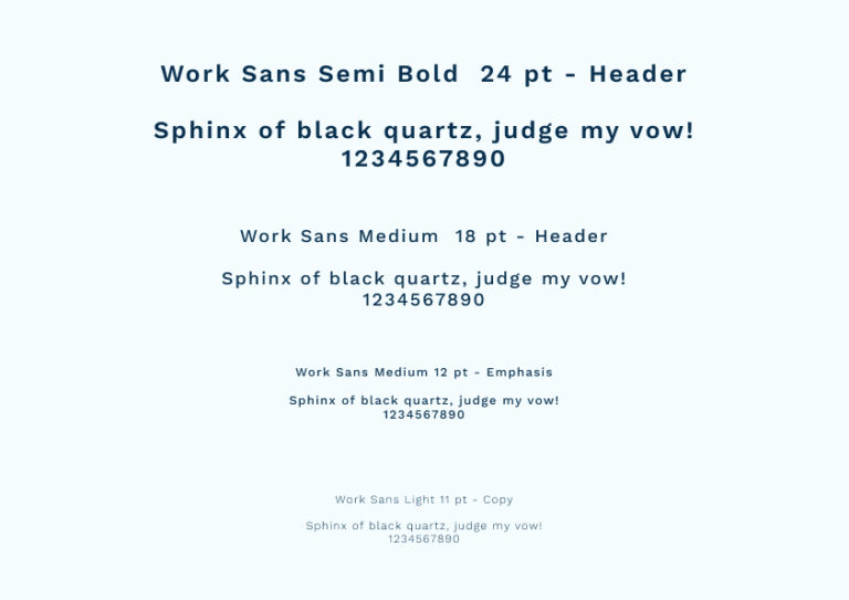
We constrained our font choices to Google Fonts so we could easily implement our brand across multiple mediums. Our initial choices were mostly clustered around san-serif options, although we looked at (and quickly dismissed) some serif + san-serif font pairings. We shortlisted Poppins, Montserrat, Lato, and Works Sans. After trying the fonts out in different configurations, we found that Work Sans hit a great balance between variety of font weights, legibility, and digital versatility. It also fit well into our existing ecosystem which was primarily powered by G-Suite.

Logo
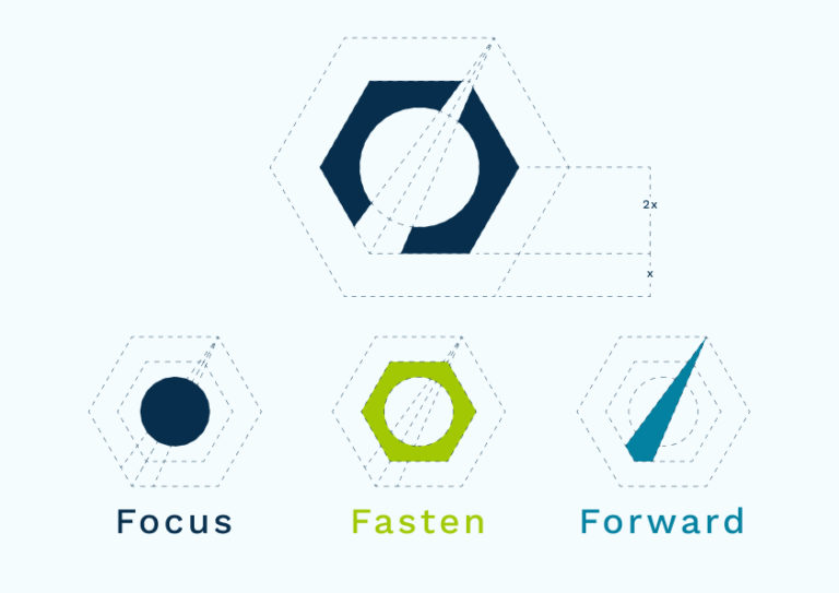
Designing a logo for Archbolt was the most challenging part of this entire re-branding effort. The name lent itself to a lot of obvious ideas (e.g. thunderbolts, an arch of some sort, a hex bolt, etc.). The real break-through happened when we started combining these different concepts. We took a step back and focused more on the values and principles we wanted to communicate rather than the form factor itself. This lead us to 3 main adjectives: focus, fasten, and forward. We wanted our logo to communicate that we helped clients focus in on a problem, fastened them into our process, and pushed forward.

Implementing the Archbolt Brand
Once the brand was finalized, I compiled all assets into a brand guide in Figma. I also created a standalone PDF brand book to serve as a static artifact of this effort. The brand was implemented across various mediums, including social media (Instagram, LinkedIn, Medium), email signatures, and our internal documents library. Over the next 9 months, I created and published over 30 document templates using the Archbolt brand. Concurrent to these efforts, Mathew, Neil, and I worked together to design a new landing page. I designed the landing page in Figma, and we had it built with a WordPress backend so we could curate our portfolio and content on the fly.

Final Thoughts
Creating a new brand is always challenging. However, it is even harder when you are doing it for yourself. I'm thankful for the opportunity to have undertaken this challenge internally, and I'm proud of the result. Archbolt wrapped up operations in January 2020, but I still wear my Archbolt shirt because of how much I liked the brand we built together!


