Visualize your projects.
Details:
Category:Product, Branding
Client:Founder
Time:Apr 2013 - May 2015
While running Elegant Solutions (ES), we were working with virtual teams and multiple freelancers and contractors simultaneously. Collaboration was a challenge that we had to solve, and we couldn't find any existing product that adequately addressed our needs. Thus, insEYEte was born. insEYEte combined the visual style of a mind map with several project management capabilities such as task, file, contact, and calendar management. Our main goal was to create a tool that allowed us to efficiently move from brainstorming to implementation, and synchronize between various parties involved at different stages in the process. We wanted to build a platform that was robust, aesthetically pleasing, and intuitive so that we could on-board clients and contractors seamlessly.
insEYEte was a long-term project, and I was involved with every step of the process from initial idea conception to implementation and iteration to my departure from Elegant Solutions in June 2015. My primary responsibilities were as a product manager and the user experience strategist.
Designing insEYEte
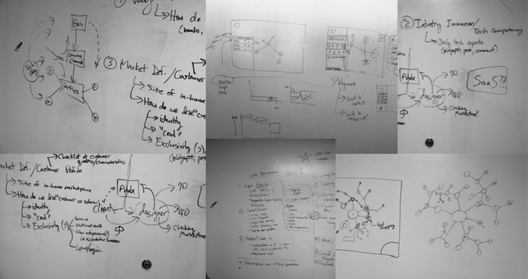
Gathering information
insEYEte was initially built for internal use by Elegant Solutions. When a client mentioned that they were interested in using the platform, we made the decision to spin insEYEte out as a standalone product. Transitioning the product out of the “silo” and into the real world took a great deal of planning and testing. To drive feature development, I began conducting implicit market research by listening to the complaints about project management voiced by other members of the incubator community in which ES was housed at the time. This gave me a baseline of understanding regarding the pain points felt by other teams. I also investigated several academic publications regarding the psychology of visual learning, and how different user interface aesthetics can affect efficiency. This helped Mike and I design front ends that were more intentional and focused on the end-user.

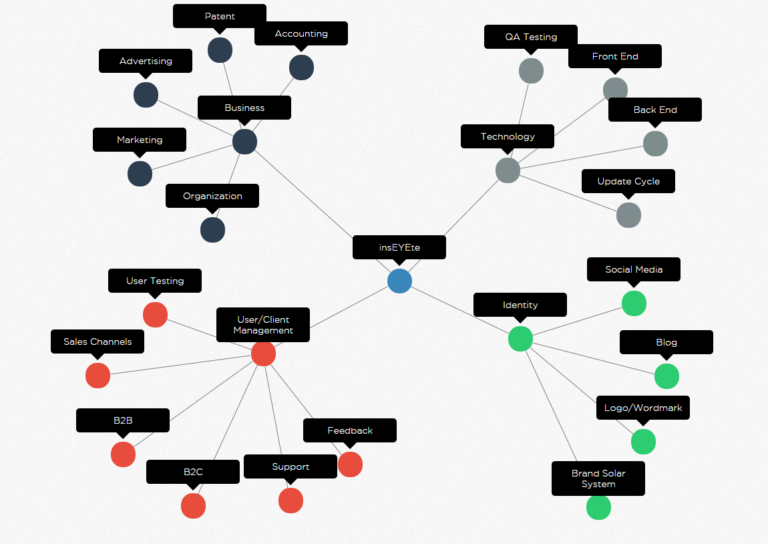
Laying Out The Plan
insEYEte was a complex product to manage. Since we were bootstrapping, the product was constrained both by budget and time available (ES was still serving clients at this time). Technical development was initially maintained through JIRA, but later transitioned to Asana for budgetary reasons.

Defining the target audience for insEYEte was tricky and involved several iterations. Initially with version 1.0, we took a shotgun approach and tested the product with individuals from various industries included legal, consulting, engineering, manufacturing, development, architecture, and so on. After several months of testing, we found that individuals in creative fields working for small agencies were most receptive to the product. Therefore, we established that our target end-user was an employee working at a small agency (smaller than 50 people) in a client-facing creative industry (such as product design, web design, or marketing) who valued aesthetics and good design. As a result, the target customers were the small agencies themselves.
Product Development
Initial Ideation
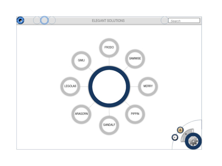
The hierarchy of data and interaction was named based on atomic structure. Atoms represent a collaborative space where users can share resources and collaborate on a project. Balancing our grander vision to see an entire network with our immediate need for a project management platform, the first version of insEYEte limited users to viewing 2 degrees from a chosen Atom. The interface was also much more rigid, and the user flow from one Atom to another was linear.

Launching V1.0
Version 1 was launched in July 2013 to begin product/market validation. While we labelled this initial release “V1.0”, it was much more of a “V0.5” or “beta” in actual practice.
Beta Testing
From August 2013 until January 2014, V1.0 was maintained and improved by continuously putting the product in front of different audiences. The official “testing” period lasted from October 2013 to December 2014. We developed surveys which was administered to the 80 “first users” (i.e. beta testers) to establish demographic data and a baseline regarding project management behavior. During the testing period, we used UserVoice to collect on-the-fly user feedback and bug reports.
Evolution (V1.0 – V2.0)
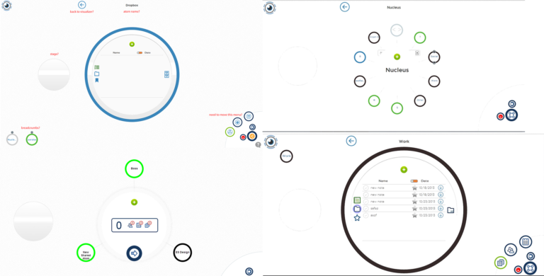
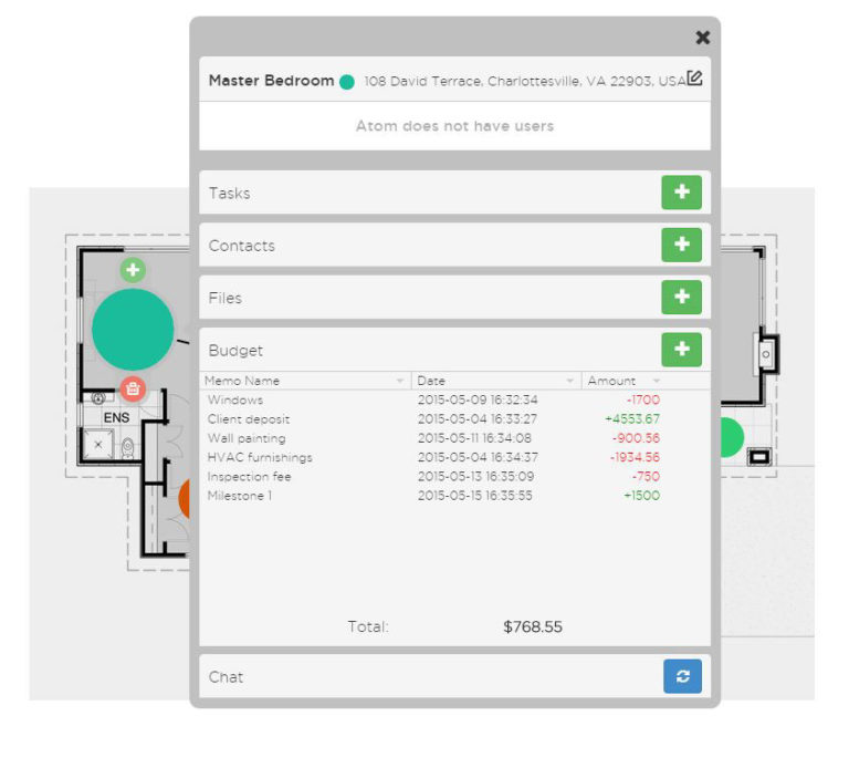
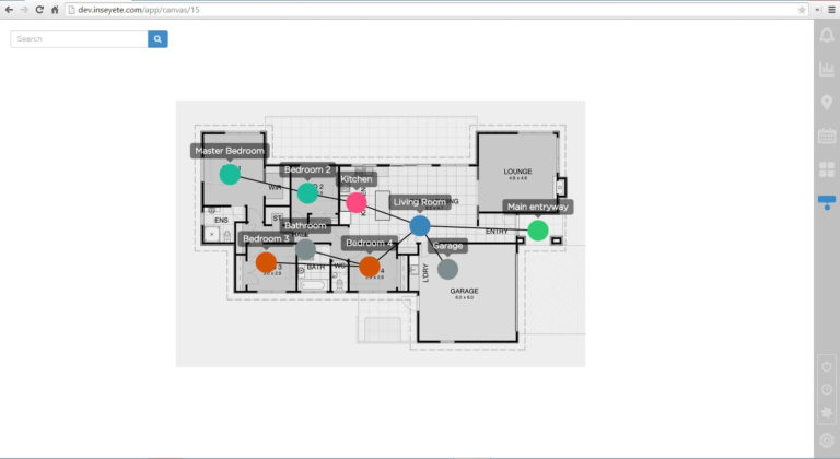
In addition to defining our target audience, the beta test gave us insights into what features could be improved or developed. Our users wanted to view more than 2 degrees from a selected Atom. Additionally, many users requested a geographic component be added. At around the same time, I discovered a brilliant JavaScript library called D3.js. D3 was built for data visualization, and featured several visualizations that were perfect for showing a mind map. Using D3 as a reference, we redesigned the primary interface to show a user’s entire network.
The biggest improvement was the ability to view Atoms on a map -- a feature which we had wanted to add since V1.0. With some tweaks, we released version 1.5 of the product in March 2014 to select users. After ironing out some bugs and factoring in their feedback, we released Version 2.0 in June 2014. This version would serve as a stable platform and increased our user base over the next 6 months.

Continuous Iteration (V2.0 – V3.0)
As we started scoring more enterprise clients and performing customizations of the platform, we realized that we needed to use a framework that was better optimized for the collaborative features of insEYEte. Working with our primary developer to research available platforms, we decided that Laravel (a very robust PHP framework) would be our best bet. Rewriting our base code in Laravel also opened up some new opportunities to add features that were requested by some of our enterprise customers.
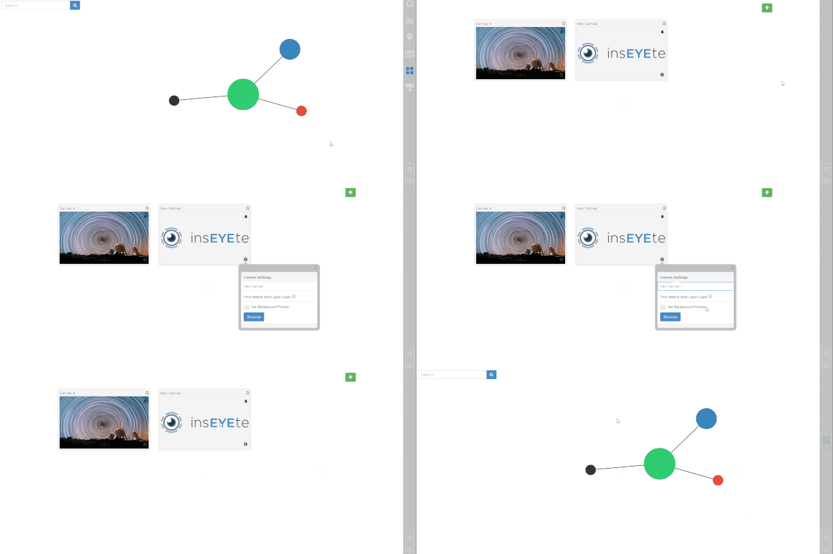
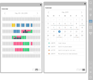
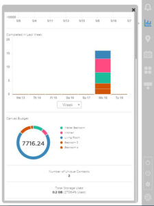
Our original intention with limiting users to one canvas was to drive user behavior to place all of their projects on one canvas so users could find unexpected intersections between all projects. However, users requested multiple canvases so they could group projects by category (e.g. personal, professional, etc.) so we decided to implement the ability to create multiple Canvases. This also gave rise to a second interface, the Canvas Toolbar. The Canvas Toolbar contained all of the interactions that applied to the entire Canvas. As a result, we were able to add a calendar view, board-level metrics, and a few other enhancements.
Final Thoughts
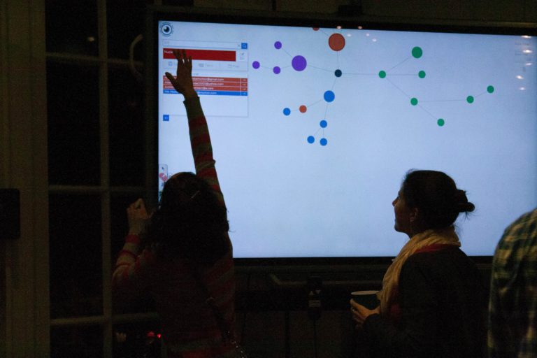
insEYEte has been one of the greatest learning experiences of my professional career. insEYEte forced me to grow as a user experience strategist and product thinker, and apply my knowledge across project management, data visualization, UI design, UX design, and interaction design. One of my proudest moments was watching users play with insEYEte on a large touch screen during an ES holiday party, and watching them have the same “ah-ha” moment Mike and I shared as we built the product.
After my departure from Elegant Solutions in June 2015, Mike licensed the platform to one of our enterprise customers and closed new sales operations. The platform continues to be used by several core users (including myself) on private installations.


