Branding a better way to leverage your professional network.
Details:
Category:Branding
Client:Workomo
Time:Feb 2020 - Apr 2020
Workomo is a system of intelligence to help "power professionals" leverage and uncover opportunities within their networks. By analyzing your calendar and meetings, Workomo “learns” about your relationships and intelligently suggests interactions to strengthen your relationships - almost like an AI-powered networking coaching. When I first connected with Workomo, they were seeking a user experience and product consultant to weigh in on decisions regarding an upcoming release of their iOS application. However, it quickly became obvious that before they could build an application with a unique user experience, they needed to establish a unique brand identity which differentiated their intent.
Prior to beginning our work, Workomo had been using a generic logo with no other brand assets. I served as the brand architect and designer on this project, while also weighing in on user experience, product, and marketing strategy.
Creating the Workomo Identity
Logo
The process kicked off with the standard onboarding questionnaire to get Workomo critically analyzing their product, industry, and problem. In addition to surfacing design guideposts, this process also helped Workomo focus their efforts for the next version of the app. During the exploratory phase, I compiled an industry brand exploration by plotting several logos against key dimensions.
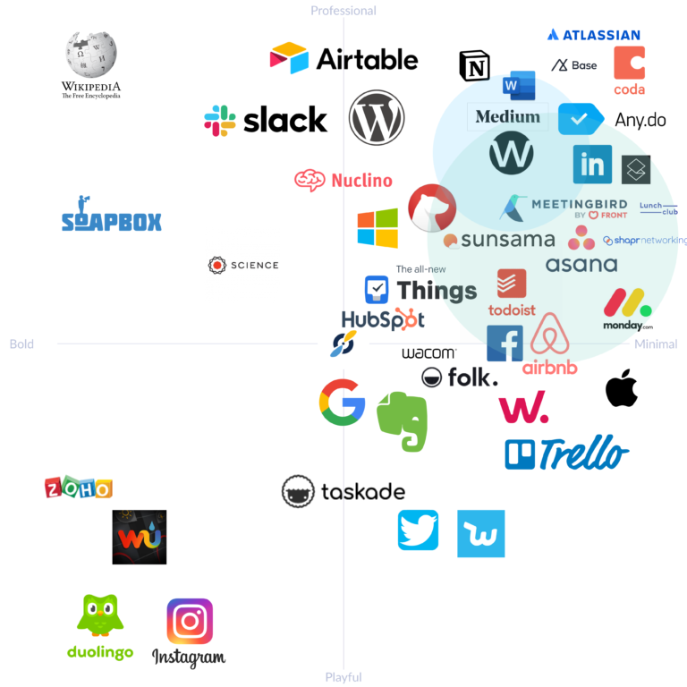
From this survey there were some clear trends such as the use of the color blue, san serif word marks, and simple logos. This helped us figure out what to focus on, as well as uncover opportunities for differentiation. Combined with the onboarding questionnaire responses, this gave me an initial direction to pursue in the rough brainstorming phase.
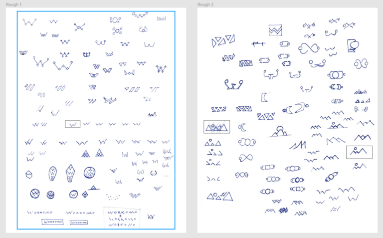
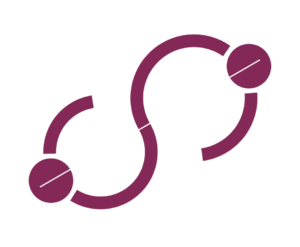
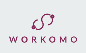
Over the course of 3 days, I drafted dozens of concepts and variants. These hand-drawn brainstorms were uploaded into Figma and cleaned up before being presented to the rest of the team. We were able to start honing in on which concepts were in the right direction, as well as which concepts were completely off-brand with what Workomo wanted to convey (for example, the shield concepts were totally off). This key step in the process helped whittle down the concepts into 2-3 meaningful directions. After iterating on those concepts, we found a direction which captured our intent. Within 2 additional rounds of iteration, we settled on a final form which consisted of 6 circles and a line -- a simple form factor packed with 3 dimensions of meaning.

The first is the most obvious: two people shaking hands with the person higher up on the right hoisting the person on the left. This was to communicate that a meeting is often about one person helping the other, and vice versa. The second meaning is the infinity sign created by the arms. This is to imply the infinite possibilities unlocked by maintaining meaningful relationships. Finally, a subtle line created using negative space connects the two heads. This signals the power of a connection, which is strengthened by direct interactions (whether face to face or digital). These forms came together in the final version:
Colors
In tandem with the logo work, I compiled the color palettes. The team wanted to differentiate from the pack while also communicating an earthy, natural feel. This was an interesting challenge: the product itself is analytical, but the team wanted the brand to convey a natural and open feel. We realized early on that we wanted a primary color somewhere between purple and maroon. After several iterations, we found a shade of magenta which really pops out against the competitive landscape.
We played with a lot of possibilities when choosing our supporting colors -- oranges, grays, blacks, greens, etc. In the end, we found a beautiful shade of teal which, when used as an accent color, elegantly popped against the primary magenta while maintaining a professional feel. Our background white revealed itself once we discovered the primary magenta. The copy color was a pleasant surprise to the entire team as we ended up using a dark shade of brown which teeters on black
Typography
The team immediately gravitated towards san-serif pairings. This made sense given the primarily digital nature of the application. To avoid licensing costs and make implementation easier, we chose to work with Google Fonts as the playing field for font choices. Although they see a lot of use across the web, Google Fonts are still highly brandable when applied with unique colors and weights. In the end, we decided on using Poppins as the display font (i.e. for titles and headers) and Nunito for the body font.
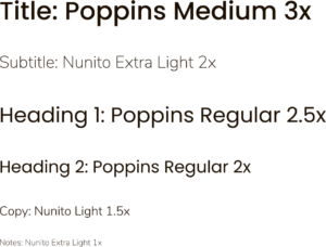
This pairing works well both on the website and in the application, and the font guide gave the team enough versatility to scale use as needed. Workomo also wanted a wordmark to complement their logo. Using a very similar process to the font selection, we went from 10 possible wordmark bases to 3 families of wordmark bases with 5-10 options (playing with line weight, spacing, etc.) per family. In the end we used a Montserrat all caps base with 25% letter spacing.

Once vectorized, the wordmark was adjusted for symmetry and balance against the logo concept. The final result is clean, and serves to complement the logo without distracting from its message.
Applying the Brand
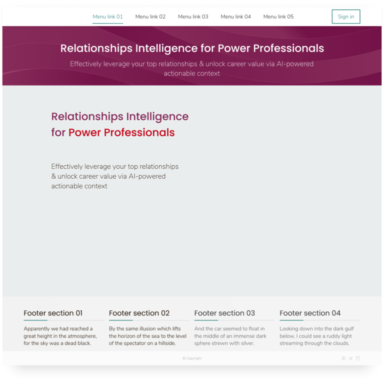
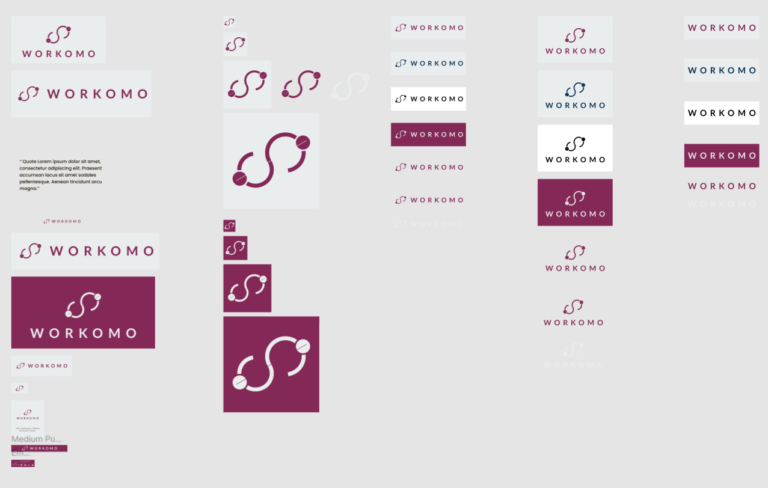
Once the brand decisions were completed, the logo and wordmark were compiled and presented in various dimensions and formats for use across social media and digital applications. The Workomo team did a great job of applying the brand colors and fonts across their app, social media, and website. I reviewed their work, and coached the team regarding improvements and potential copy revisions. The final brand guide was shared via Figma for easy management and export of the various assets.
Final Thoughts
Workmo aims to help power professionals manage their relationships and networks with greater efficiency and intelligence. The brand we constructed for Workomo communicates this promise through a calm and distinct visual identity.
In addition to communicating the Workomo promise externally to potential users, partners, and investors, the brand also gave the internal team a greater sense of coherence around the Workomo vision. It was great working with an agile team that prioritized moving fast without cutting any corners. By investing heavily in the earlier exploratory phases, we were able to move efficiently through the actual mechanics of creating the brand. The decisions were all made as a team and embody the combined perspectives of engineering, business, design, and marketing. As the company continues to grow, the brand will grow with them and can be applied to marketing materials, business cards, and other collateral!
You can see the brand in action on Workomo's website as well as on Twitter, LinkedIn, and AngelList.


